Best Ways To Improve Readability In 2023
Have you ever wondered how sometimes you can read a text on a poster from far away, but other times you cannot? Sometimes you are able to read text on a white paper sheet without any difficulty, but other times you really need to focus or strain your eyes in order to read each word.
A lot of things from color scheme to quality of paper and ink as well can determine how well the text is readable on paper or the poster. Yes, of course, Black on white paper is the most common and probably the most readable color combination, but what about other color combinations that work sometimes but won't work other times.
Even with some web pages or websites, you can notice the same issues where you need to squint your eyes and really focus to make sense of the text. Even though we may think it's all about the colors, there are a few other factors that may be at work too. We will throw some light on the readability through this article and find out how to achieve the maximum readability.
Background color
Color has been studied for many decades now for legibility and readability in different types of digital media and print media. As already mentioned, there is a reason that black or most colors work best on white paper or background.
Research shows that the brain has a tendency to read black text over white background more readily than others, even white text on black background. It has also been researched that even if a little color is present in the background, it may not affect the readability as much as the brightness of the background colors in contrast with foreground colors.
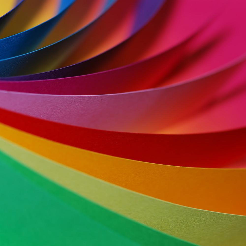
So since black and white show the highest amount of contrast the same as Black on yellow background, the best combinations for optimum readability. However, the worst combinations for readability on any medium is green text on an orange background, as well as Red text on a green background.
Color scheme
Colors are also known to incite specific effect and emotions. In order to understand which colors you want to use you may want to know a little about what these colors are able to do to the reader.
Yellow symbolizes clarity and warmth, which may be something that people want to covey with their work. For those who want to appear confidently friendly and cheerful through they work or maybe their brand use orange for their text, images or logos.
While green provokes strength, dependability and trust, white and black may look more towards rouse balance and calmness. You could then spend some time in checking the contrast with other colors and how easily visible or legible it is.
Quality of paper
While you want to ensure readability of a document, you will have to come across whiteness and brightness of paper at some point. The degree of blue light that is reflected from a paper can dictate the ease by which text can be read.
Different kinds of papers can have different kinds of treatment done to it for a specific kind of appearance, which may affect the readability factor. Uncoated paper that is highly absorbent may blur the edges of your text on print, which may look beautiful but also reduce the readability.
On the other hand, using coated paper can ensure high contrast colors and sharp-edged text in your prints, making it easier to read and note the details of images too.
Text size and sentence length
Apart from color playing a critical role in improving or reducing the readability of any text document, the size of the text can also play an important role. Usually, while reading, a person is able to fixate their gaze on 1 to 2 words at a glance. That means shoulder sentences are able to gather and hold much more attention than longer sentences.
Especially in a document such as a resume, too many long sentences do not make any sense, just like text based advertisements must have as few as possible words to make an impression. The number of words per line may differ over different mediums.
While an advert will require and comparatively large size for text, a document will also need an optimum size of text to be easily readable. The text size that is larger than adjacent smaller sized words will obviously attract attention first, then smaller letters.
To conclude, it's possible to improve the legibility and readability of your documents but it only requires a bit of research. With all the information that is available for free for us to use and make the most out of, there is hardly anything that cannot be improved or fixed. Have you ever tried to improve on your document, make sure to share your experience with us in the comments.